
I chose four landscape prints and four “body part” prints as my final works.
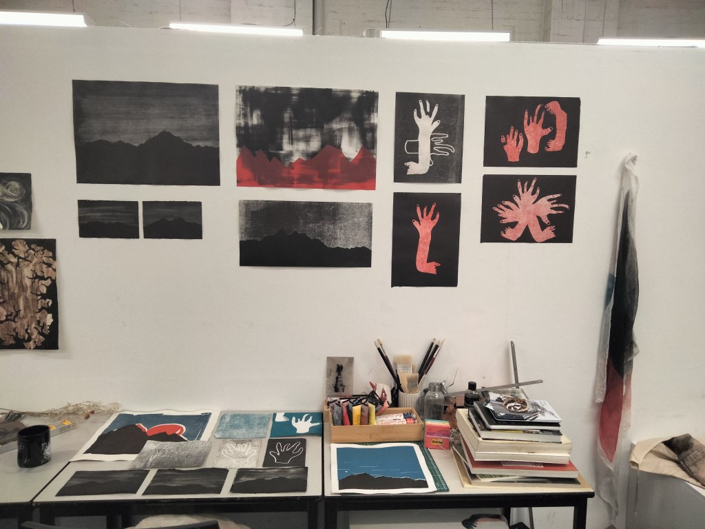
I chose not to incorporate the three colour piece I created that was discussed in my first blog (seen in top left of the table in the image above). Adding extra colour layers to the work ended up difficult due to the registration of a border along with the three layers. The final piece ended up not as clean as I had originally envisioned. The other landscapes also aesthetically matched better with their dark and moody atmosphere.
Three more prints in the same black monochrome style with monotype backgrounds were created. For the one seen in the middle of the frame, the cheesecloth stencil technique used in the “body part” prints was incorporated for the background. This added an rougher texture to the print that I liked the aesthetic of. I also created three smaller images in the same vein as the original print (top left). I made the stencils of both these images align so the diptych formed one complete image. It was originally envisioned as a triptych but the edges of the paper were damaged and made the three images no-longer cohesive. This work is presented in it’s triptych form on my website gallery as I was able to crop the edges for a digital gallery display.
I am pleased with the way the red and black tones match one another across the landscape and “body part” prints. It managed to reflect the idea I aimed to communicate of landscapes and the body being both personal, intimate places to me. If I were to develop this idea, I would potentially incorporate the landscapes and body parts into a singular print in-which the distinction between body and landscape are blurred.

Leave a comment