
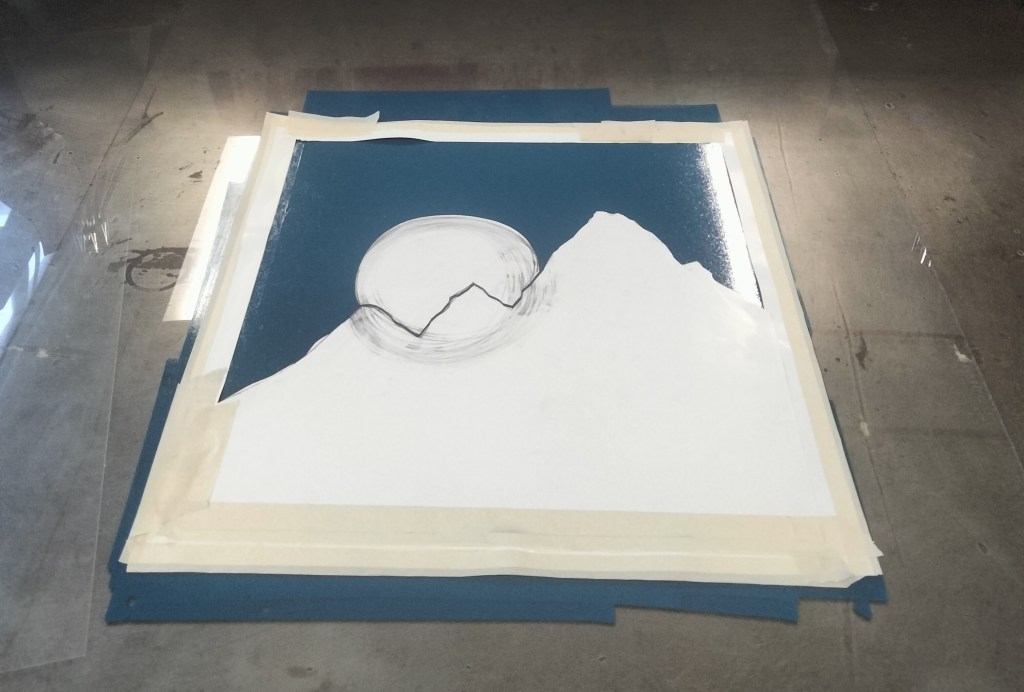
My first monoprint experiment was planned out to be a three colour print with grey mountains in the foreground, a red sun in the midground and a blue sky for the background. I was inspired by Bauhaus artists such as Kandinsky with their sleek, clean lines and use of primary colours. My goal for this print was to create a clean, solid colour landscape. I rolled out a combination of blue, white and black ink to form a middle dark blue sky colour. My sun, mountain and border stencil was lay down and I pressed my first layer.

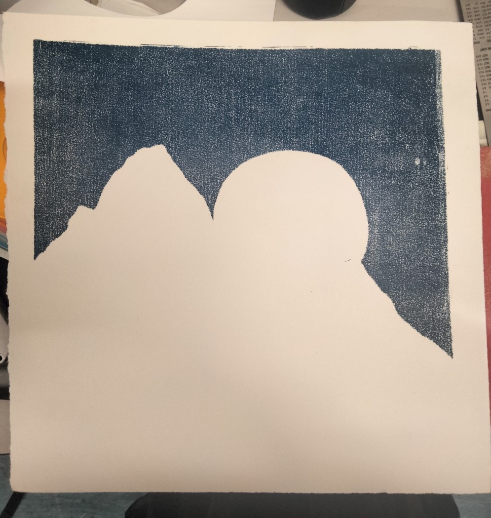
Immediately I realised that I had forgotten to wet the paper, and thus the ink was not evenly applied to the paper, opposite to my intention. Despite this mistake, I ended up liking the result as the uneven application gave a textured appearance to the sky and made it look as if there was a layer of clouds within it.

Leave a comment